West Consulting Group
West Consulting Group
UX Designer & Frontend Developer Intern (2025)
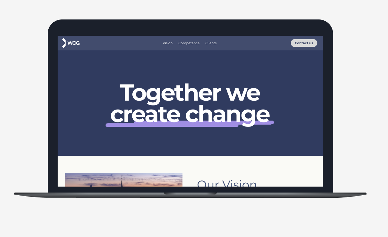
I was responsible for redesigning the company’s existing website to better reflect their brand, improve usability, and modernize the overall user experience. The project involved working end-to-end in the design and development process, starting with reviewing the current site and identifying improvement areas. We worked in an agile way with continuous feedback, iteration, and close collaboration across the team. In addition to the design work, I also contributed to the implementation of the new website, coding parts of the frontend using React.
The finishd product


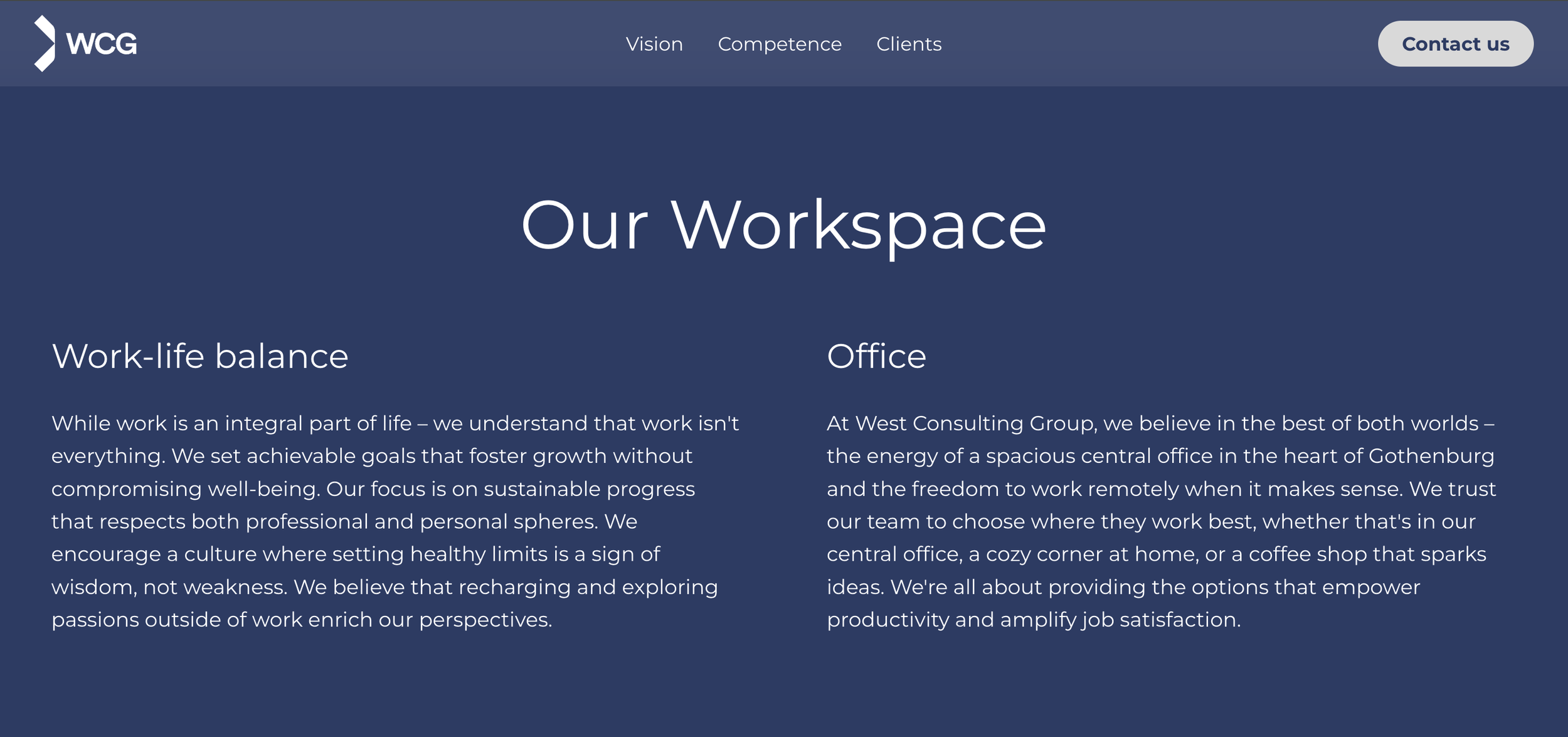
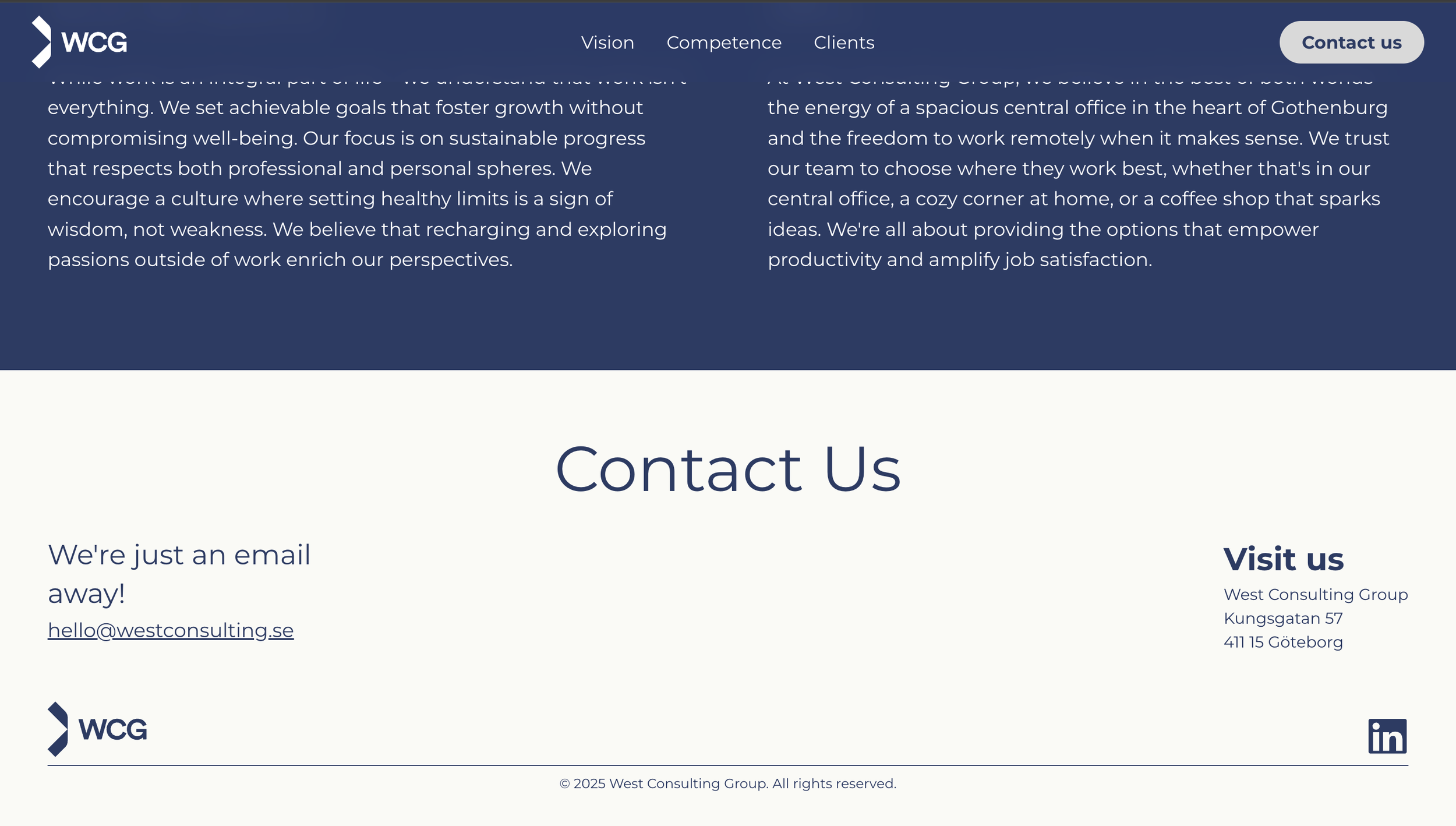
The starting point
The first step was to evaluate the existing website and identify areas for improvement. Based on these findings, and in close collaboration with the client’s goals and preferences, I defined the requirements and objectives for the new design.

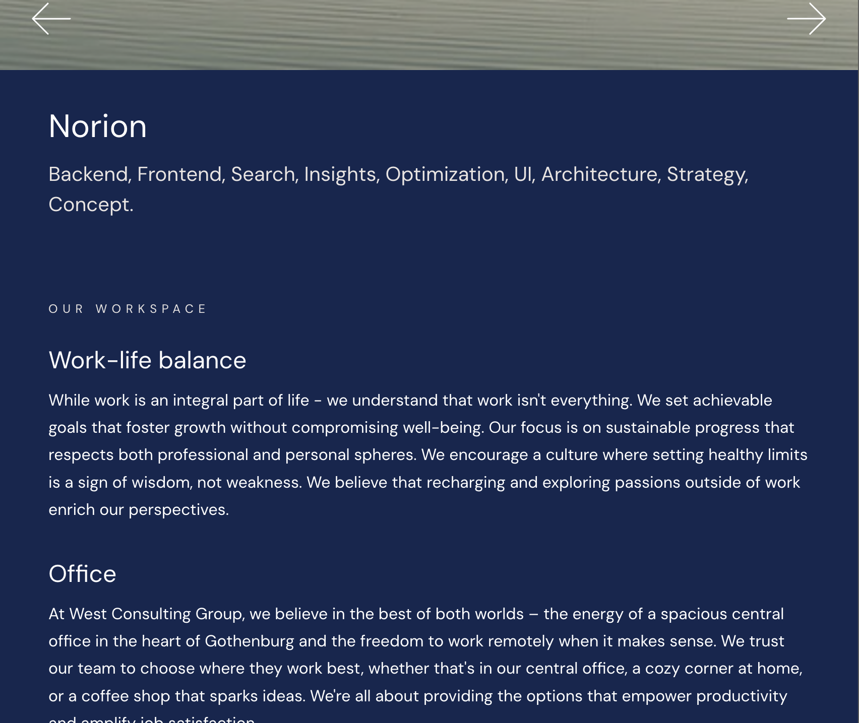

Key UX Improvement Goals
1. Establish a clearer visual hierarchy
Many sections currently look the same, and the long text blocks lack visual breakpoints. Headings, subheadings, spacing, and contrast do not differ enough, making it difficult for users to know where to focus. The goal was to create a stronger visual hierarchy that guides the eye more effectively.
3. Refresh the color palette
The current palette is very monotonous, with most sections using the same dark tones. The goal was to introduce lighter colors and clearer separation between sections to create better visual structure, rhythm, and clarity.
5. Introduce a sticky header for improved navigation
The original website did not include a sticky header, which made navigation less accessible when scrolling. The goal was to implement a sticky header to ensure that key navigation elements remain visible at all times, improving usability and allowing users to move between sections more efficiently.
2. Reduce text density and incorporate more visual elements
The existing site contains a large amount of text, which can overwhelm users. To improve readability and engagement, the goal was to introduce more images, icons, and visual components to break up the text and support faster information scanning.
4. Apply consistent spacing and margins
The site lacks consistent spacing and margin usage, resulting in an uneven layout. The goal was to establish a cohesive spacing system to ensure a more polished, balanced, and professional visual experience.
I created simple sketches to communicate my ideas to the client.
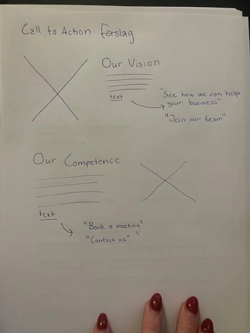
Idea - Call to Action Conceptual design

Image carousel

Overall layout
I created prototypes in Figma to communicate my design ideas before implementation began. I also produced visual style explorations, including color maps showing proposed color schemes and accent colors for the new design.
Prototyping
